
Back to Guidelines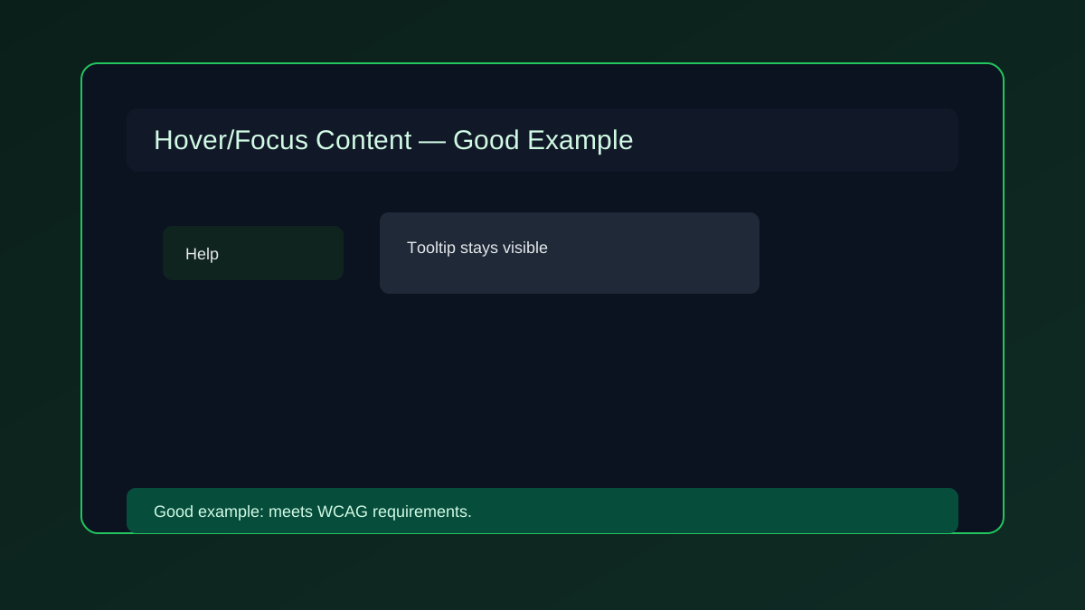
- Perceivable
- WCAG 1.4.13
- Level AA
What is Content on Hover or Focus?
Additional content shown on hover or focus must remain dismissible, hoverable, and persistent.
The content should not vanish before users can read or reach it.
- Keyboard users.
- Mouse and touch users.
- Users who need persistent help text or tips.
- Improves Accessibility
- Better Interaction
- Better User Experience
- Supports Compliance
Good vs Bad Examples
Use the tabs to compare persistent help content with disappearing tooltip behavior.
Persistent hover content
html live code
<button aria-describedby="tip">Help</button><div id="tip" role="tooltip">Tooltip content</div>Why this is correct:
- Content can be dismissed without losing focus.
- Users can move to the tooltip without it disappearing.
- Supports WCAG 1.4.13.
Implementation Checklist
Progress0 / 6 completed (0%)
Knowledge Check
Answer Yes or No to test your understanding of hover or focus content.
Score: 0 / 5 · Answered: 0 / 5