
Back to Guidelines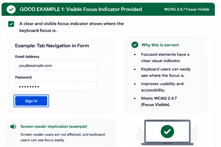
What is Focus Visible?
A visible focus indicator should always show keyboard users where focus has moved, even when the page contains forms, links, or dense content.
Clear focus styling helps prevent confusion and makes navigation more reliable for people using keyboards, switch devices, and other non-pointer input methods.
- Make the focus ring easy to spot on every interactive control.
- Use enough contrast so the indicator stands out from the page.
- Keep focus visible when users move through content with the keyboard.
Good vs Bad Examples
Use the tabs to compare the accessible pattern with the example to avoid.
Good Example 1 – Visible Focus Indicator Provided
html live code
<button className="focus:ring-4 focus:ring-blue-600 focus:outline-none">Sign In</button>Why this is correct (developer logic):
- Focused elements have a clear visual indicator.
- Keyboard users can easily see where the focus is.
- The interaction is easy to track and understand.
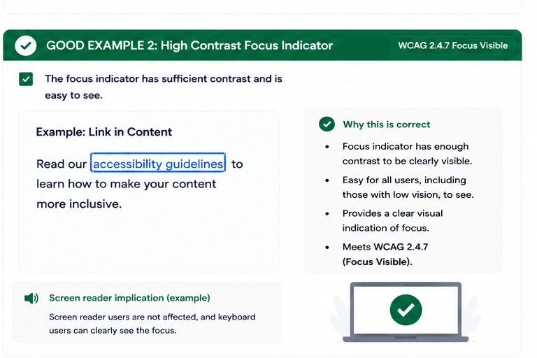
Good Example 2 – High Contrast Focus Indicator
html live code
<a href="#" className="focus:ring-4 focus:ring-blue-600 focus:outline-none">accessibility guidelines</a>Why this is correct (developer logic):
- The focus indicator has enough contrast to stand out.
- Users with low vision can see where focus moved.
- The visual indication is easy to distinguish from the page content.
Implementation Checklist
Progress0 / 5 completed (0%)
Knowledge Check
Answer Yes or No to test your understanding of focus visible.
Score: 0 / 5 · Answered: 0 / 5